
Designing for India: Playbook | 매거진에 참여하세요
Designing for India: Playbook
#overses #india #ux #strategy #culture #design #function


A Product Playbook for Winning the Next Billion Users
India isn't just a fast-growing market — it’s a fundamentally different digital environment. If you're building a product for Indian users, designing for speed, trust, and extreme diversity isn’t optional — it’s your baseline.
Let’s break down what it really takes to succeed.
A Mobile-Only Nation with Unique Constraints
India is home to over 1.4 billion people, and more than 700 million access the internet only via mobile
— predominantly budget Android devices. While mobile data is among the cheapest globally, network stability varies drastically between regions.
Add to that a linguistic puzzle: English is common only in urban centers. Over 20 languages are spoken widely
— Hindi, Tamil, Telugu, Bengali, Marathi, and more — making "translation" a feature, not a setting.

Speed and Simplicity Over Polish
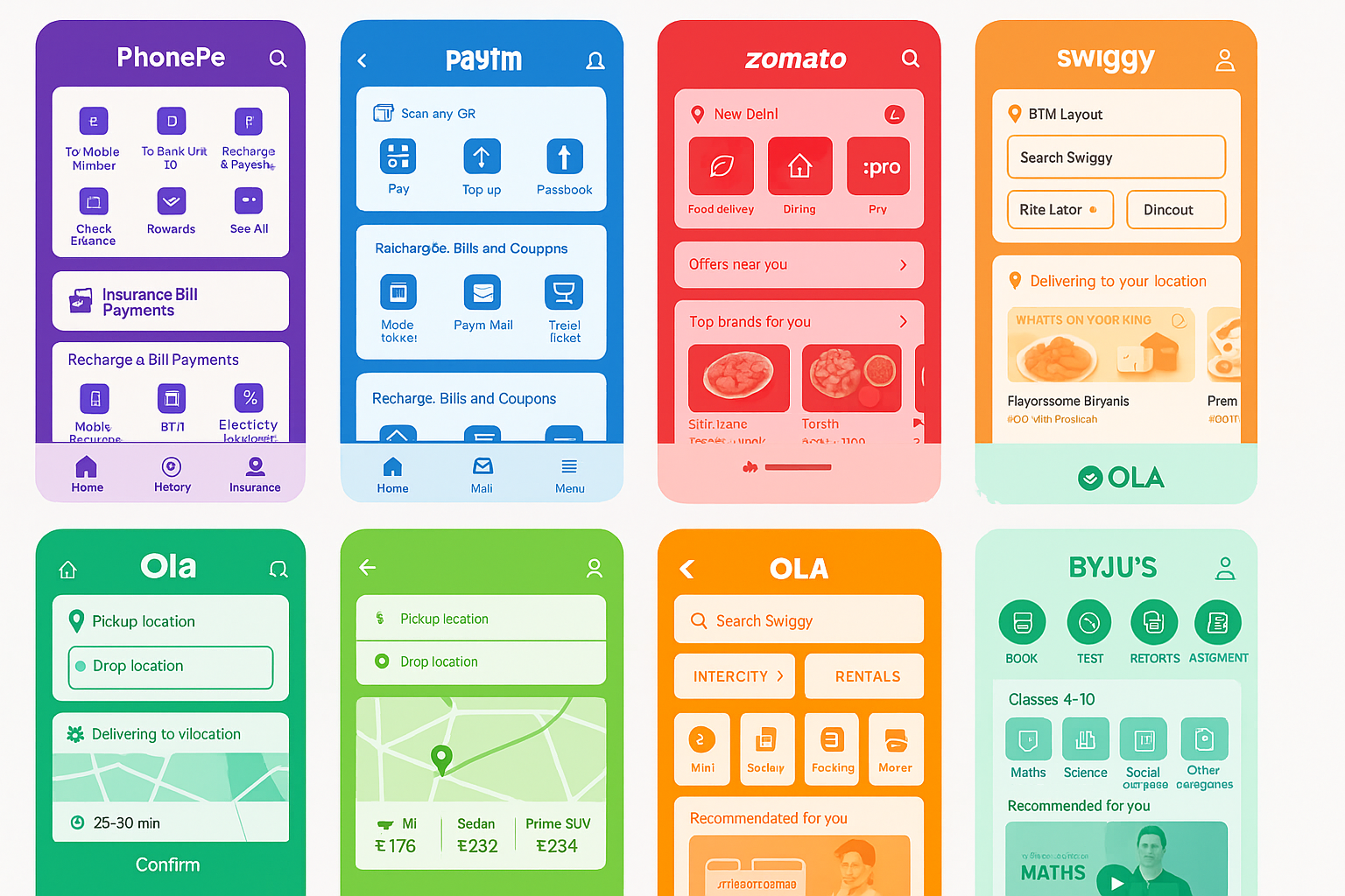
In India, apps that lag don’t get a second chance. Zomato, Swiggy, PhonePe — all top apps are obsessively optimized for performance.
- Images are dynamically compressed based on connection speed.
- APIs retry automatically under low connectivity.
- Loading states are minimal, UI is icon-first, and transitions are snappy.
Practical tips:
Implement lazy loading with multi-CDN fallback.
Prioritize vector icons and SVG over heavy images.
Remove unnecessary transitions or animations.
Multilingual UX: It’s Not Just Translation
Most Indian users prefer content in their native languages. But localization isn’t just text translation — it’s UI rebalancing.
Text strings vary wildly in length. Fonts like Devanagari render differently.
Common UX patterns like icons, tooltips, and even CTA positioning need to adapt.
Practical tips:
Build dynamic-width buttons and responsive layouts.
Use lightweight fonts that support Indian scripts.
Offer language selection during onboarding, not deep in settings.
Payment UX = Visual Trust
Despite the growth of UPI (Unified Payments Interface), payment fraud remains a top concern.
Even QR-based payments need to “feel” trustworthy.
Top apps like PhonePe and Paytm address this with:
- Clear visual states: green for success, red for failure.
- Trusted icons and labels: "100% Safe", verified badges.
- Progress indicators: OTP steps, QR scans, and confirmations are all visualized.
🛠️ Practical tips:
Always show real-time updates to prices, bonuses, and rewards.
Use large icons, color-coded messages, and microcopy to reduce anxiety.
Integrate WhatsApp for transaction confirmations.
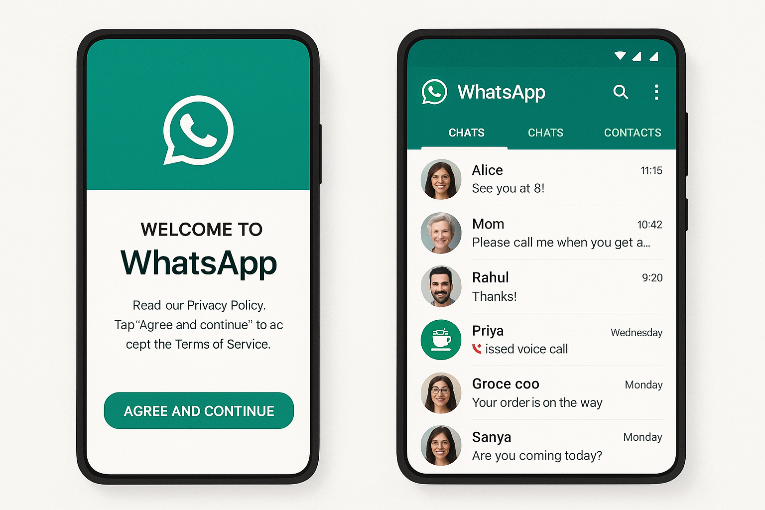
Super App Culture + WhatsApp = The Default Flow
Indian users are comfortable doing everything inside a single app. Paytm, for instance, handles payments, bills, shopping, insurance, and rewards — all from the home screen.
And WhatsApp? It’s not just for chatting
— it’s the de facto channel for customer support, order tracking, payment receipts, even product discovery.
Practical tips:
Plan WhatsApp Business API integration early.
Let users complete support or confirmation flows on WhatsApp.
Design offline-to-online conversion flows via QR and messaging.
QR and Camera as Primary UX Tools
Offline-to-online experiences are central to Indian app behavior.
Whether paying at a street vendor or hailing an Ola, QR codes are everywhere.
Apps like Swiggy and Ola streamline this with:
Instant camera access (with permission onboarding).
Scan → Confirm → Receipt via WhatsApp or SMS.
Fail-safe UX: explain what to do if the scan fails or retries are needed.
Bright Colors, Bold Contrast, and Big Buttons
Forget minimalism. Indian users favor high-contrast, bright color schemes. Think Paytm’s blues, Swiggy’s oranges, and Zomato’s reds.
UI needs to be unmistakable: buttons should pop, cards should cast shadows, and calls to action need to scream “Tap me.”
Practical tips:
Combine brand color with high-contrast hues like orange or green.
Use big, round buttons with strong elevation.
Design grid-based card layouts with drop shadows.
Onboarding is Not Optional — It’s Your First UX Test
A significant portion of India’s user base is still digitally new.
Apps like BYJU’S and PhonePe guide users with generous onboarding, tutorials, and tooltips.
Get your first 60 seconds right, or risk being uninstalled.
Practical tips:
Offer a dedicated onboarding mode with step-by-step help.
Let users skip or revisit tutorials anytime.
Reinforce onboarding with WhatsApp or SMS nudges.
6 Indian Apps You Should Study Closely
- PhonePe – Minimalist UPI UX with rock-solid reliability.
- Paytm – The Swiss army knife of Indian apps; wide breadth, visual trust cues everywhere.
- Zomato – Performance-tuned food delivery with intelligent image compression.
- Swiggy – Real-time updates and aggressive optimization for low-bandwidth environments.
- Ola – Ride-hailing with offline fallback, intuitive mapping, and payment flexibility.
BYJU’S – EdTech with a super friendly, beginner-first design ethos.
TL;DR: How to Win India
1. Optimize for low bandwidth and budget devices.
2. Treat localization as core infrastructure.
3. Leverage WhatsApp as a default channel.
4. Focus UX on clarity, trust, and action.
5. Local testing with real users isn’t optional — it’s survival.
If you're planning to launch in India, start with empathy, not assumptions.
Build for people — not personas.
refer to bunzee.ai

- link_kakaolink_kakao_url
- link_operatorlink_operator_url
- link_investhelp@letspl.me
- link_ad_urllink_ad
